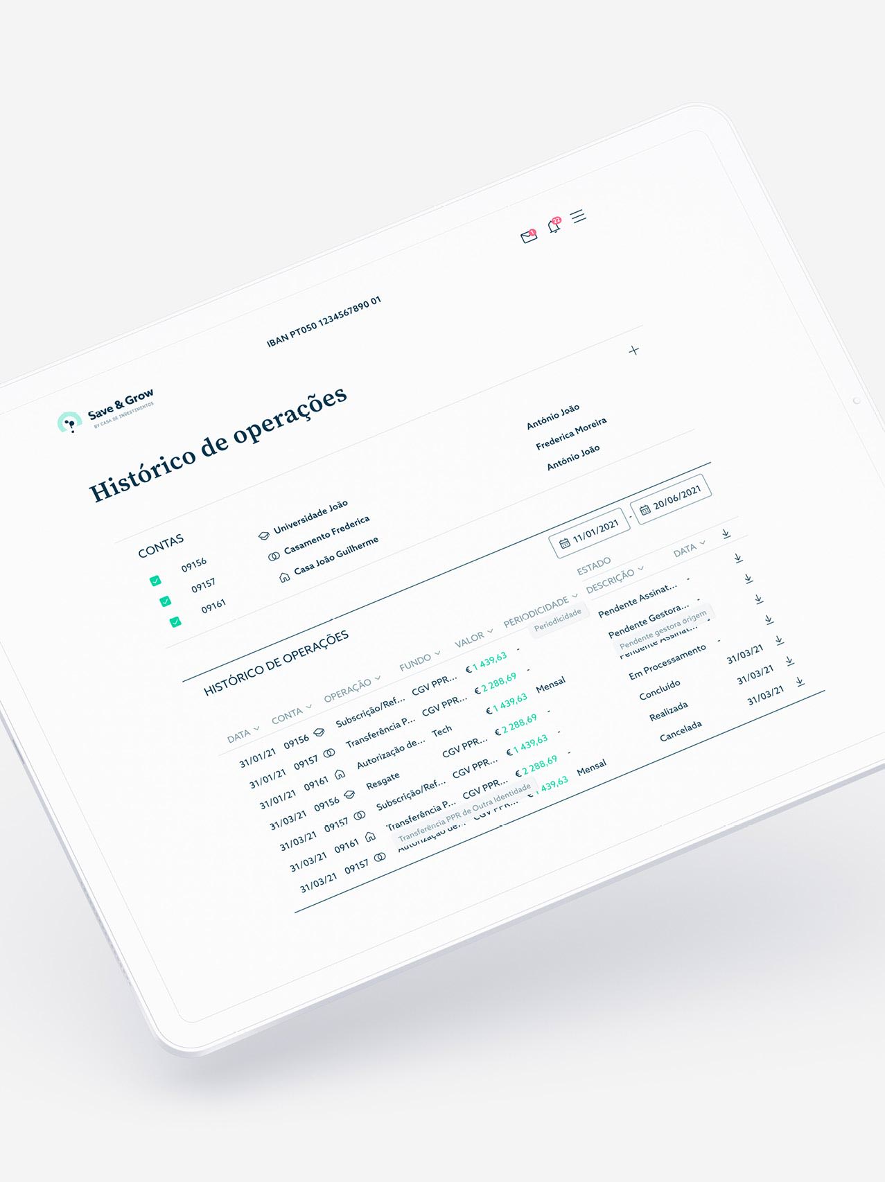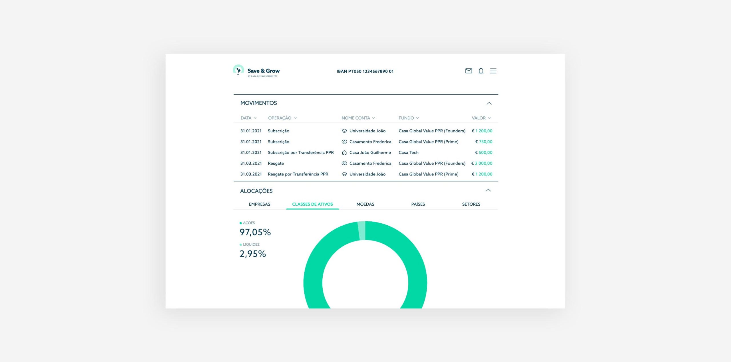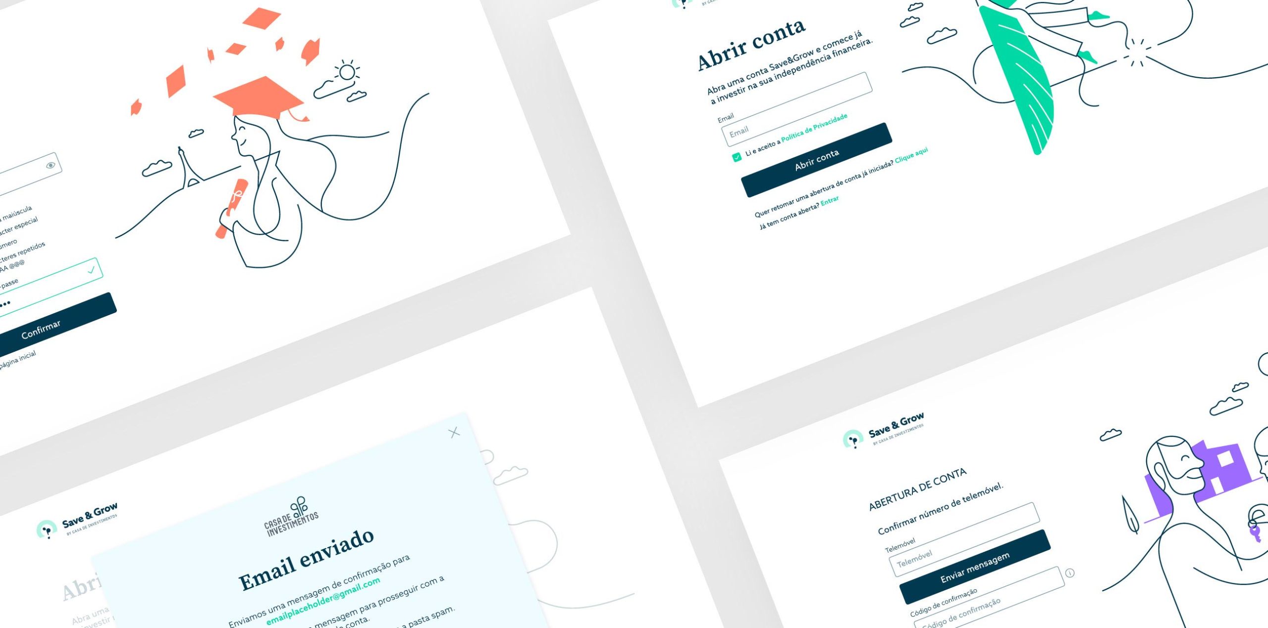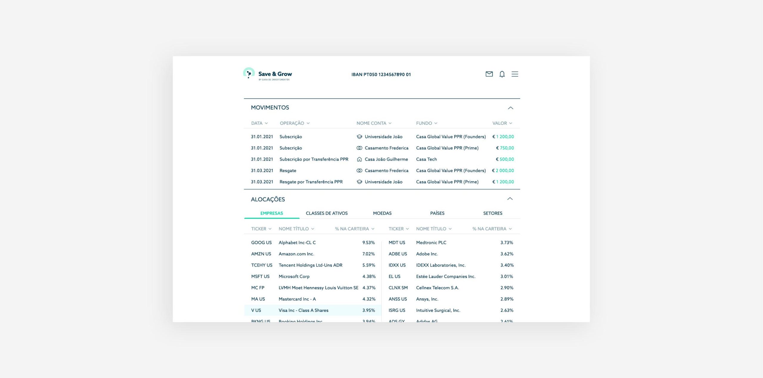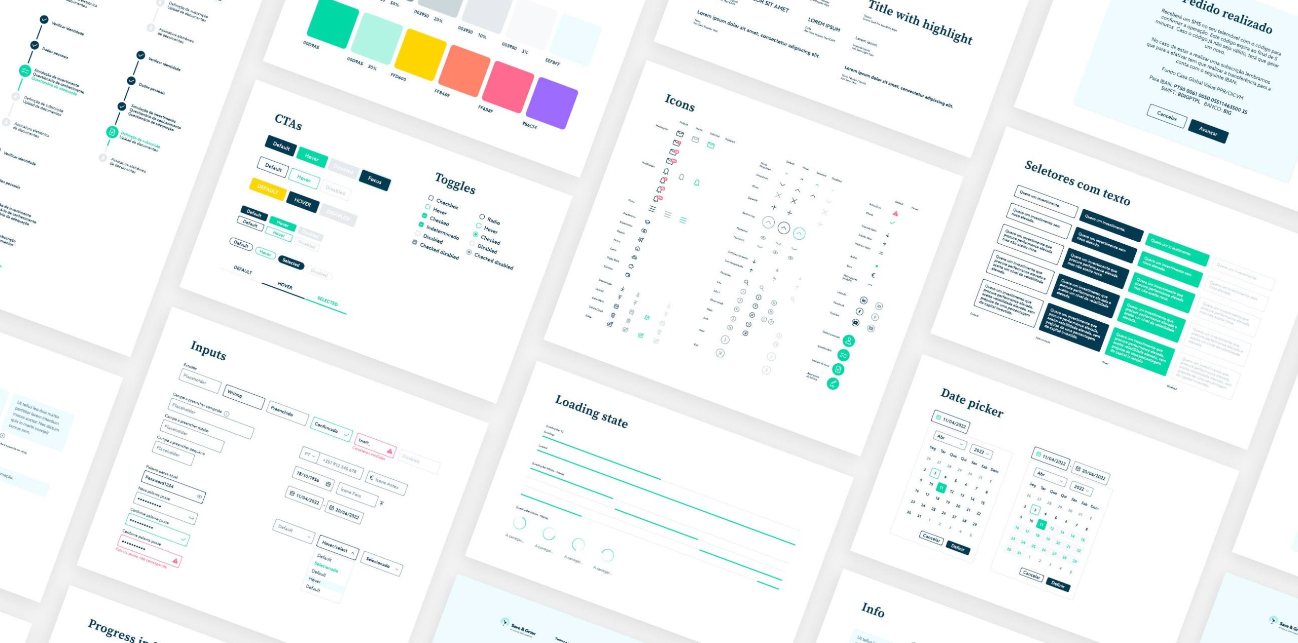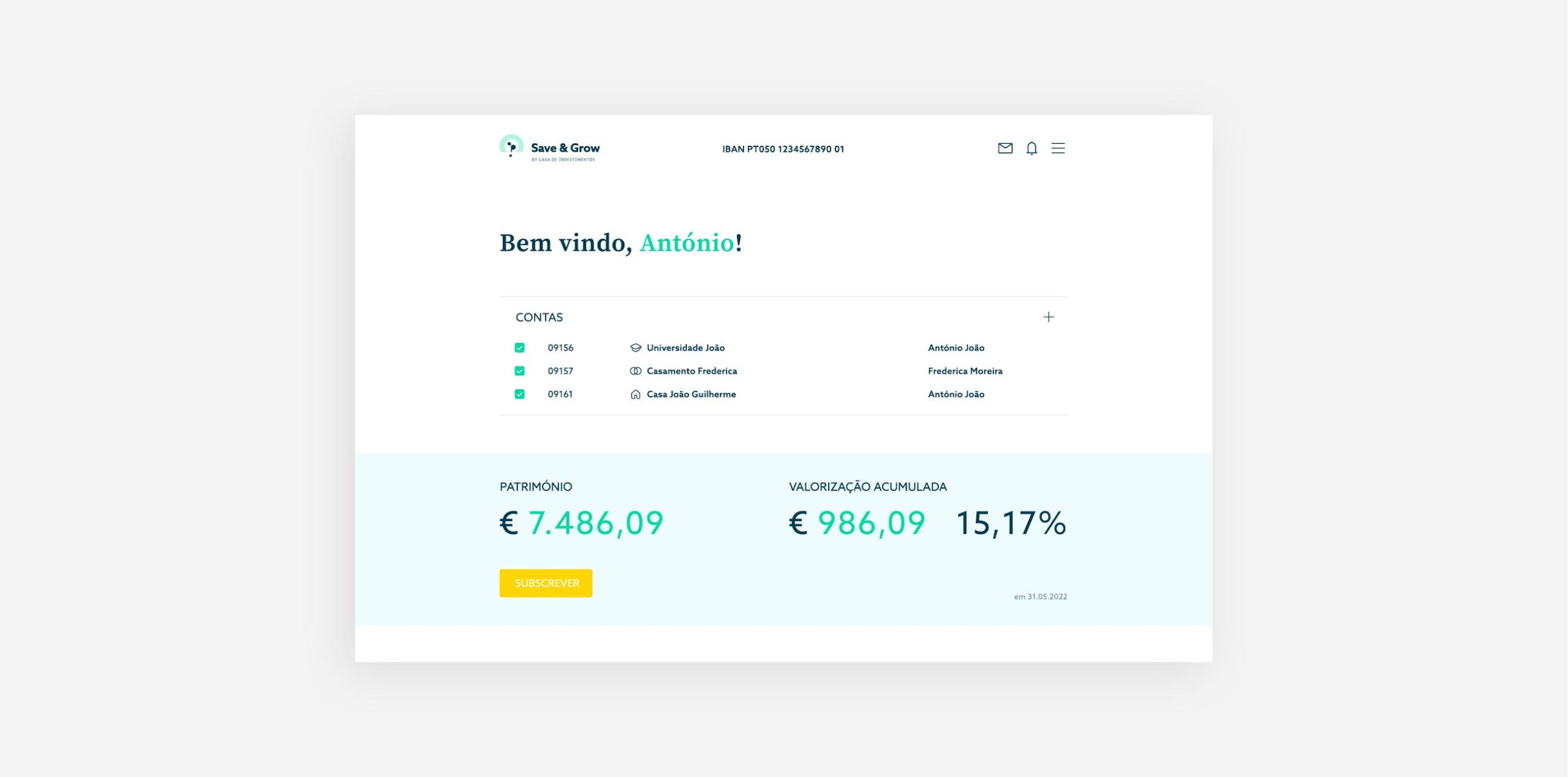
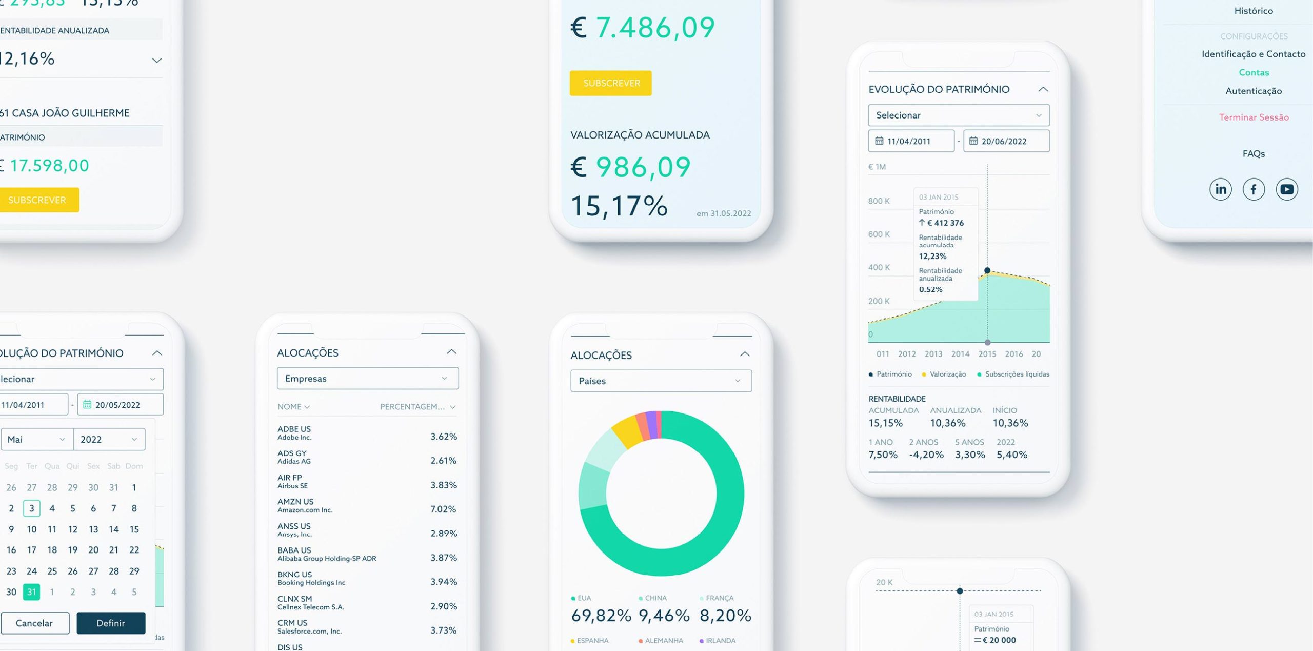
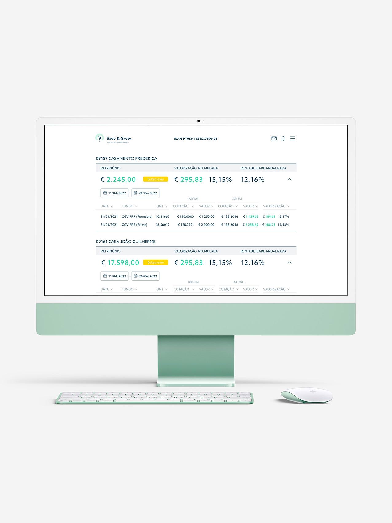
Based on the language developed on the website’s presentation page, we designed the entire user area, from subscription to assets management, for a great experience and consistent visual language. We defined clean layouts and tables thought to detail, priming usability, legibility, and readiness of information. Transparency was the core value to consider, reflected in light tones, balanced typography with a well-defined hierarchy, and clear infographics to convey pertinent information.
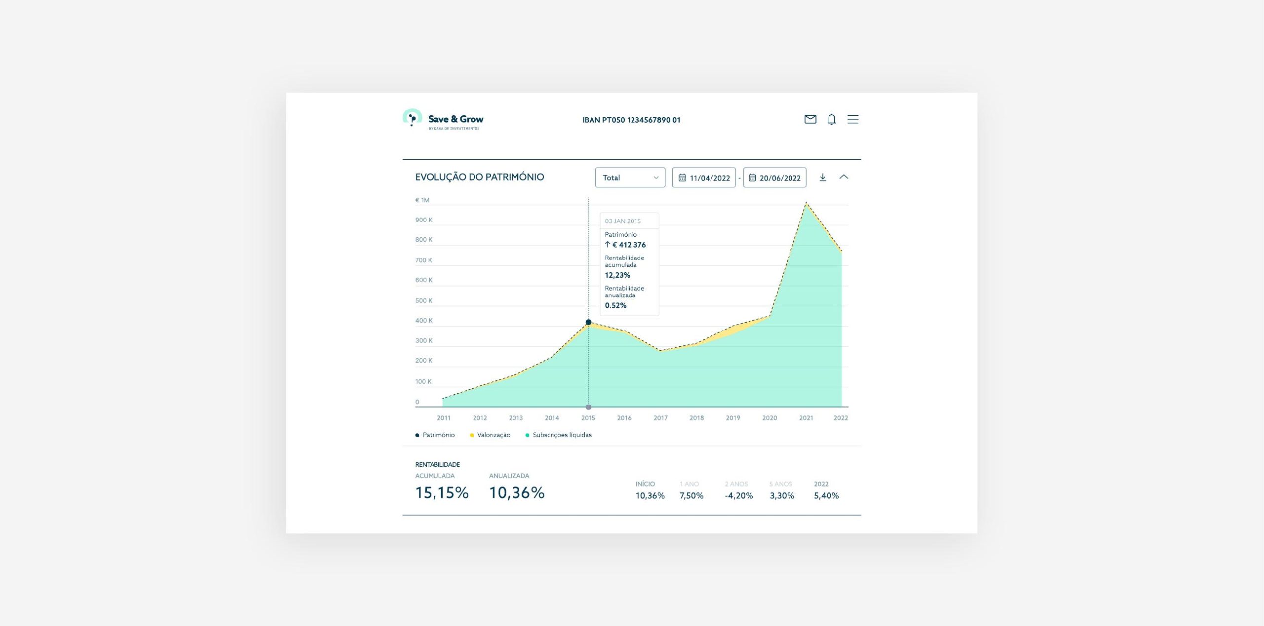
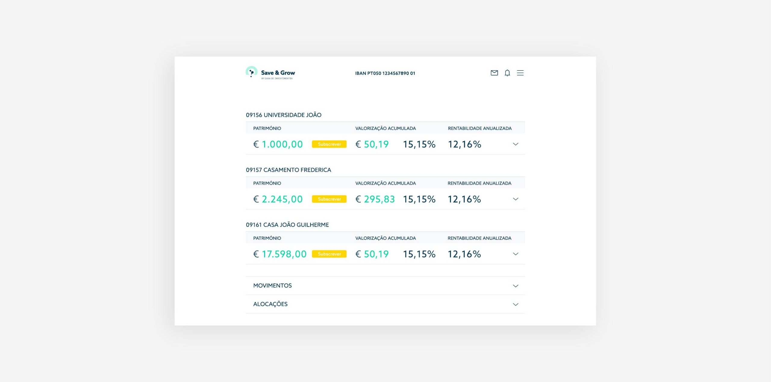
Page layouts; iconography; interactive and static infografics; UI elements; style guide.
Together with the developing team, we have customized every digital environment associated with internal processes for customers, including pages and flows for a dashboard/global view, operations, documentation, messages, notifications, personal area, and settings.
