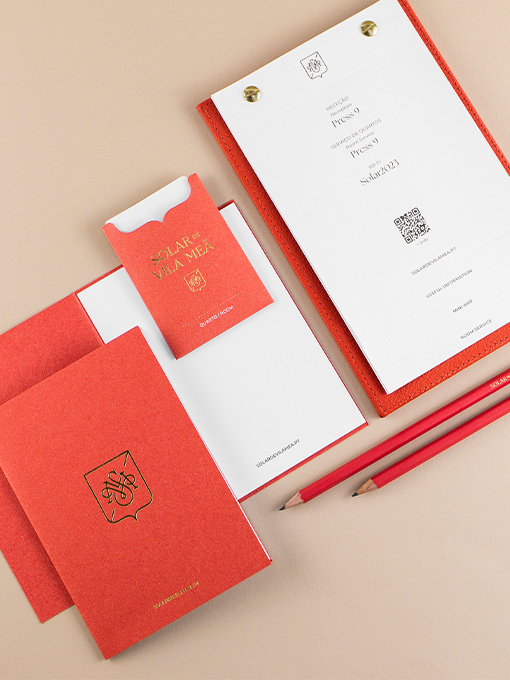
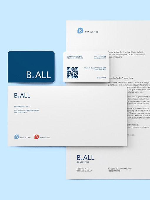
This experience celebrates Rosé Wine with all its freshness and fun. It immerses visitors in the world of Rosé with an exaggerated, exuberant, and sensorial Rosé degustation. Each room within The Pink Palace is different and unique, with photo-worthy and shareable...
Nutrida
Offering personalized content and a unique experience, this brand pops out from other projects. The logo and visual ecosystem were designed to reflect its dynamism and flexibility. A modular identity, custom iconography, and versatile color swatches (food inspired)...
Rootine
Roots are strength and sustenance, the basis of what grows and rises, be it a tree, a house (foundations), or life itself (values). Going for a visual metaphor of life as a growing and everchanging element, we dwelled on the concentric rings that emerge from a...
Aquanostra
Aquanostra's logo already existed when we got to be part of this project, but it required some love and further structuring. We kept in mind the communication strategy in progress and our target audience when structuring all visual communication, developing a...
Larica Food Congress
Through a dynamic identity, which symbolically represents the various food groups, we have built a system that lives on the broad range of applications of the brand, which results in a set of colors, patterns, and typographic compositions with a young and energetic...
Magrid
This brand will live on digital supports, mainly through the Magrid App. We have worked on a logo that reflects a sense of union and versatility through the typographic representation of connections. Vibrant colors and a playful look and feel contribute to...
Sem Espinhas
Considering the need for unified but differentiated communication, we have proposed a photographic approach as a baseline for all visual materials. The focus was to depict Espinho's fish and seafood as the raw matter that brings everything together. Specific...
JDIM
This event is organized by and directed to young medical doctors, so a dynamic and fresh identity was mandatory. Vibrant colors, clean elements, and contemporary typography helped to create a welcoming graphic universe. Based on a composed logo with a recognizable...
Group-Super
The core concept guiding this project is transformation, common to all company's services. The identity works from a grid system of three different units, where the forms evolve to form the initials of each sub-brand of the group. The result is a versatile identity,...