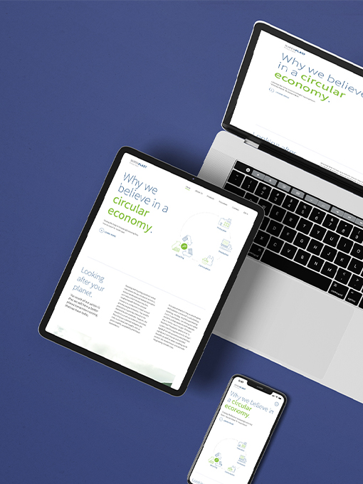
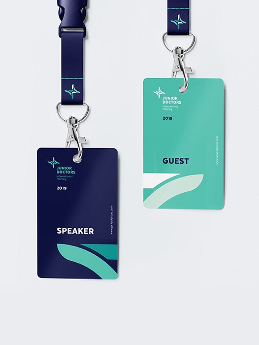
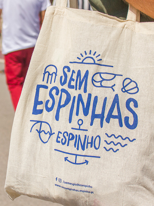
Through a dynamic identity, which symbolically represents the various food groups, we have built a system that lives on the broad range of applications of the brand, which results in a set of colors, patterns, and typographic compositions with a young and energetic...
Sem Espinhas
Considering the need for unified but differentiated communication, we have proposed a photographic approach as a baseline for all visual materials. The focus was to depict Espinho's fish and seafood as the raw matter that brings everything together. Specific...
JDIM
This event is organized by and directed to young medical doctors, so a dynamic and fresh identity was mandatory. Vibrant colors, clean elements, and contemporary typography helped to create a welcoming graphic universe. Based on a composed logo with a recognizable...