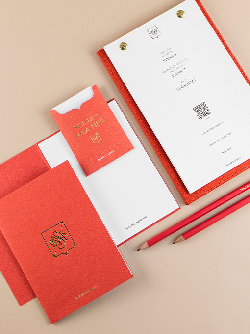
Business cards, envelopes, letterheads, booklets, keycard sleeves, water bottle labels, notebooks, amenities packaging, and signage were designed for the hotel. Combining gold foil, offset printing, and the powerful colour and texture of the paper, these materials...
Gardenuity
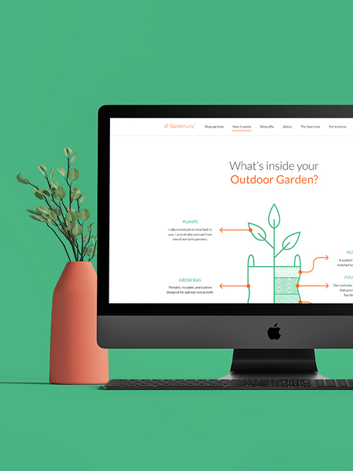
Divided in two different websites, customer oriented and B2B, the brand's digital presence embraces a welcoming, nature-inspired aesthetic through simple, clean design elements. Although very different in structure, the two websites present a cohesive look & feel,...
SuperPlast
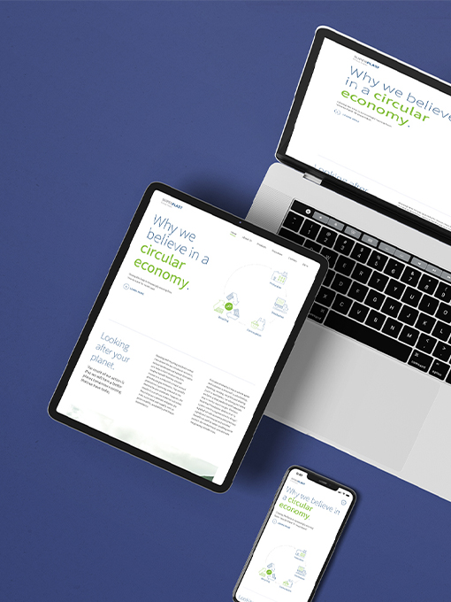
The SuperPlast website highlights the brand's concept and the recycling and circular economy processes clearly through explanatory infographics. With a strong presence at international fairs, various materials such as roll-ups, brochures, pens, and totebags are...
Planta-la
Specializing in plants with exposed roots, it creates unique experiences that connect people to the rich history of plants. The concept, “Every Way Growth,” highlights the organic beauty and resilience of plants as they flourish in water-based environments.Inspired by...
EABA
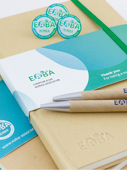
Scientific projects require clear communication of complex information. Impactful infographics facilitate understanding and enhance dissemination, attracting investment and delivering the right message to stakeholders. The brand identity captures the association’s...
Cell4food
Warm tones and infographic elements create an inviting look, essential for building brand trust and connecting with the target audience. With primary touchpoints at international fairs, presentations, and the website, we developed cohesive materials to ensure a...
General Annual Assembly
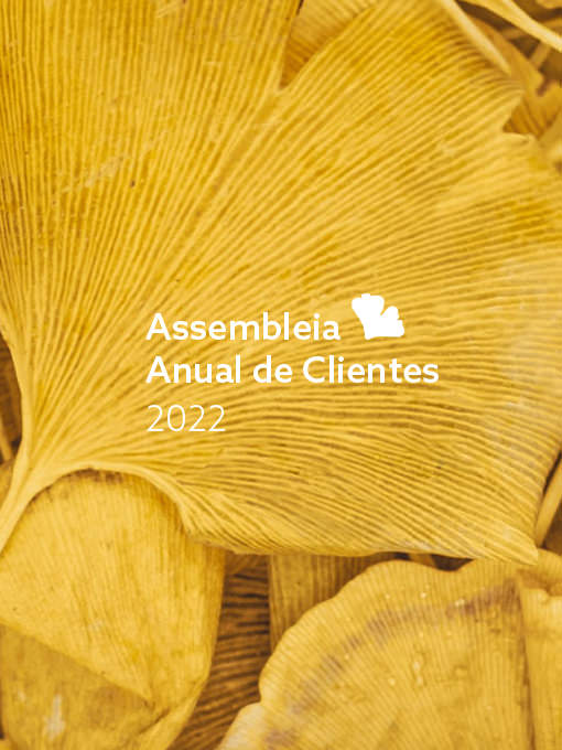
The General Assembly is an annual event dedicated to their clients, that lives with its own visual identity although always aligned with the main brand. This identity is adapted annually accordingly to the established theme in the Financial Report correspondent...
B.ALL
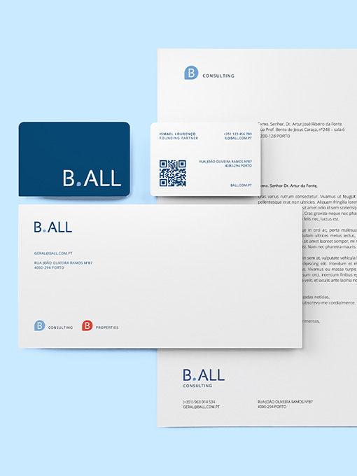
The identity is anchored on the potential of mediation to enable all opportunities to "be all you can be". Trust, integrity, and accuracy are core ideas made visual through a solid typographic brandmark. Balanced and distinct, this logo conveys the brand's values and...
Rootine
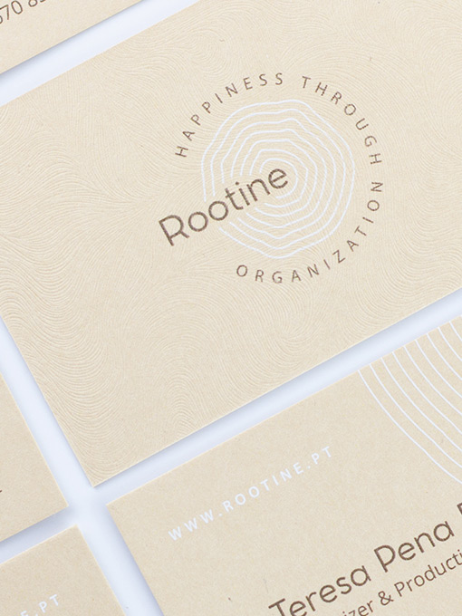
Roots are strength and sustenance, the basis of what grows and rises, be it a tree, a house (foundations), or life itself (values). Going for a visual metaphor of life as a growing and everchanging element, we dwelled on the concentric rings that emerge from a...
Nutrida
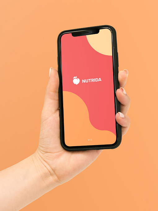
Offering personalized content and a unique experience, this brand pops out from other projects. The logo and visual ecosystem were designed to reflect its dynamism and flexibility. A modular identity, custom iconography, and versatile color swatches (food inspired)...
Aquanostra
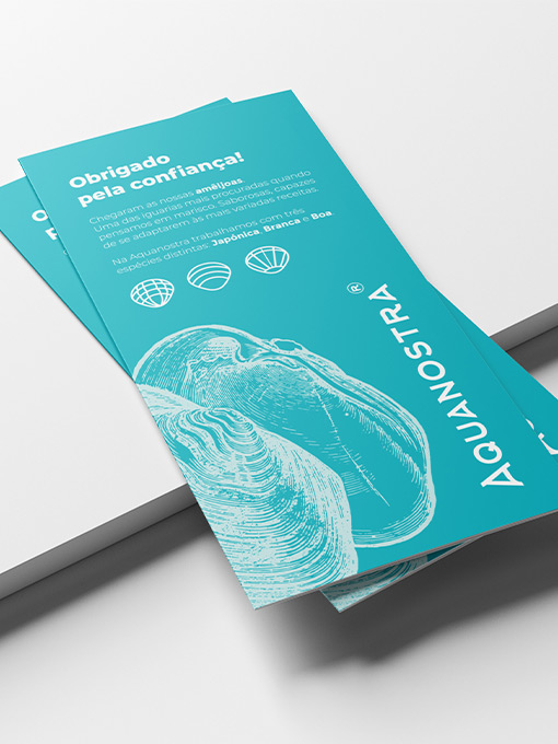
Aquanostra's logo already existed when we got to be part of this project, but it required some love and further structuring. We kept in mind the communication strategy in progress and our target audience when structuring all visual communication, developing a...
JDIM
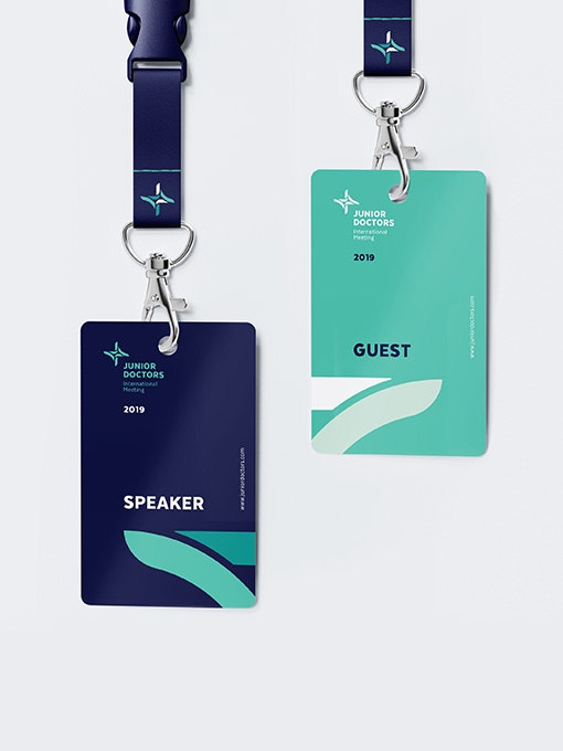
This event is organized by and directed to young medical doctors, so a dynamic and fresh identity was mandatory. Vibrant colors, clean elements, and contemporary typography helped to create a welcoming graphic universe. Based on a composed logo with a recognizable...
