Rootine
Rootine focuses on designing personalized plans to improve your life quality, through the organization of places, objects, time, information and routines.
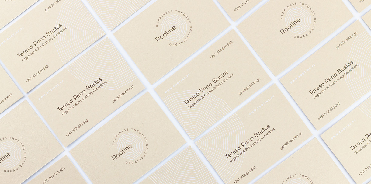
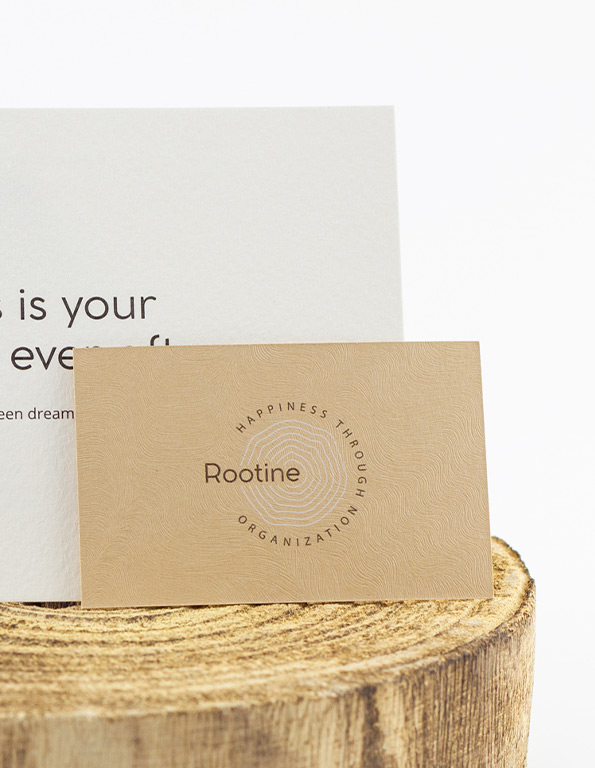
Roots are strength and sustenance, the basis of what grows and rises, be it a tree, a house (foundations), or life itself (values). Going for a visual metaphor of life as a growing and everchanging element, we dwelled on the concentric rings that emerge from a sectioned tree. Concentric lines represent time passing, various cycles, and phases, growth, as they also direct our minds towards our own fingertips representation. Focused on improving life, this brand exists through a symbol that communicates personalization as the outcome of all the layers that keep making our existence ever more intricate. It is the baseline for organizing what revolves around us towards a happier life.
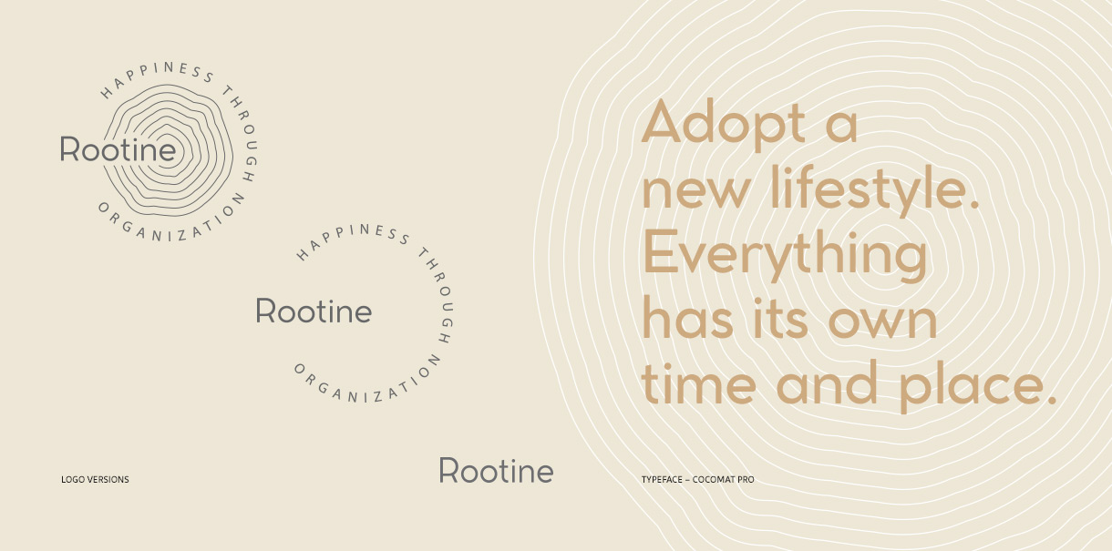
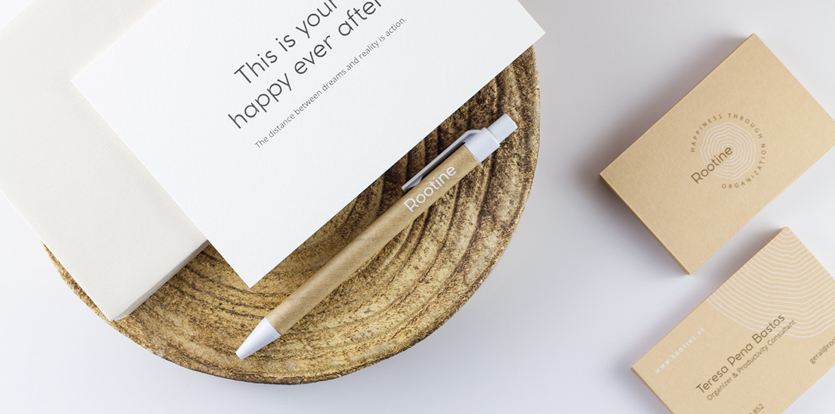
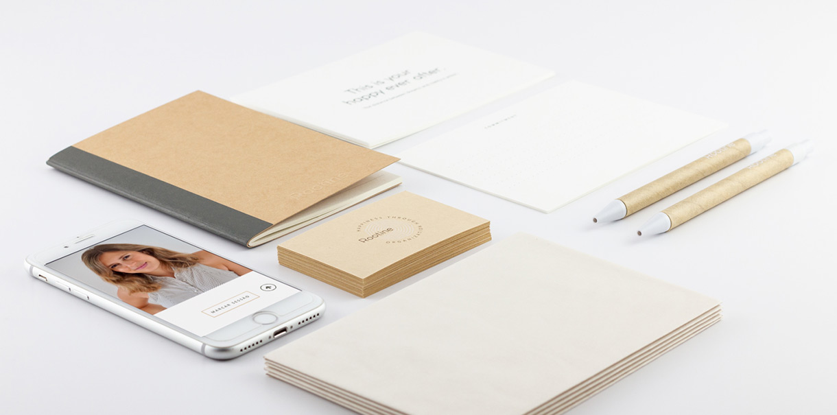
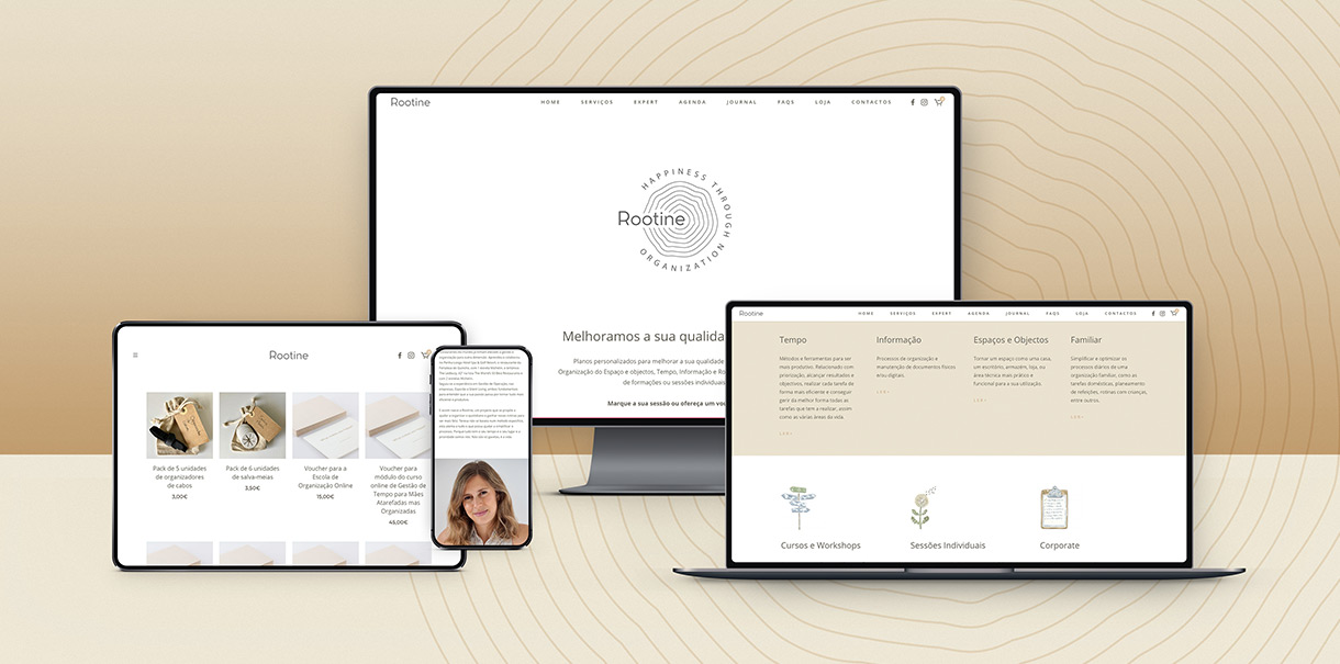
Logo, Business cards, Stationery, Booklet, Voucher, Embossing stamp, Social Media templates and guidelines, Website.
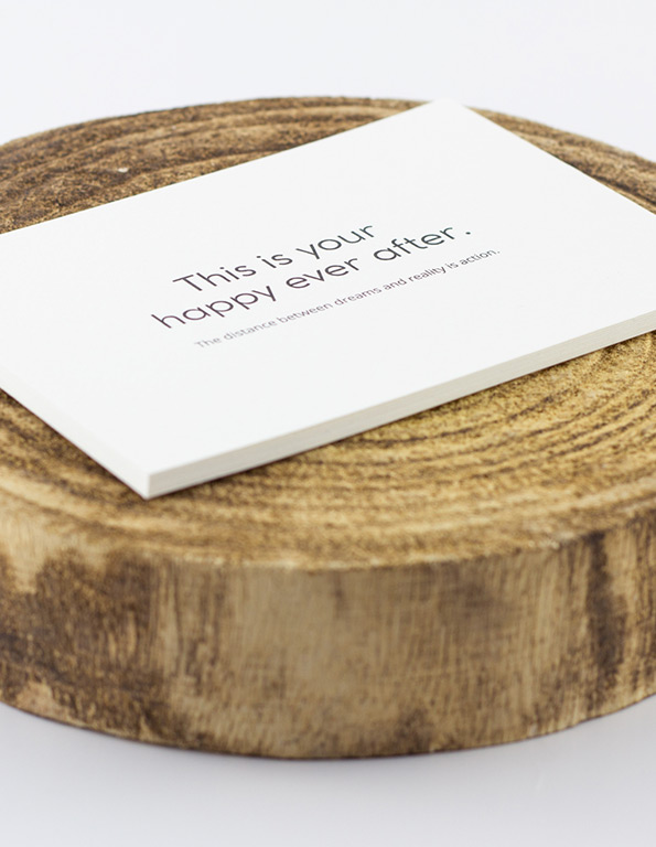
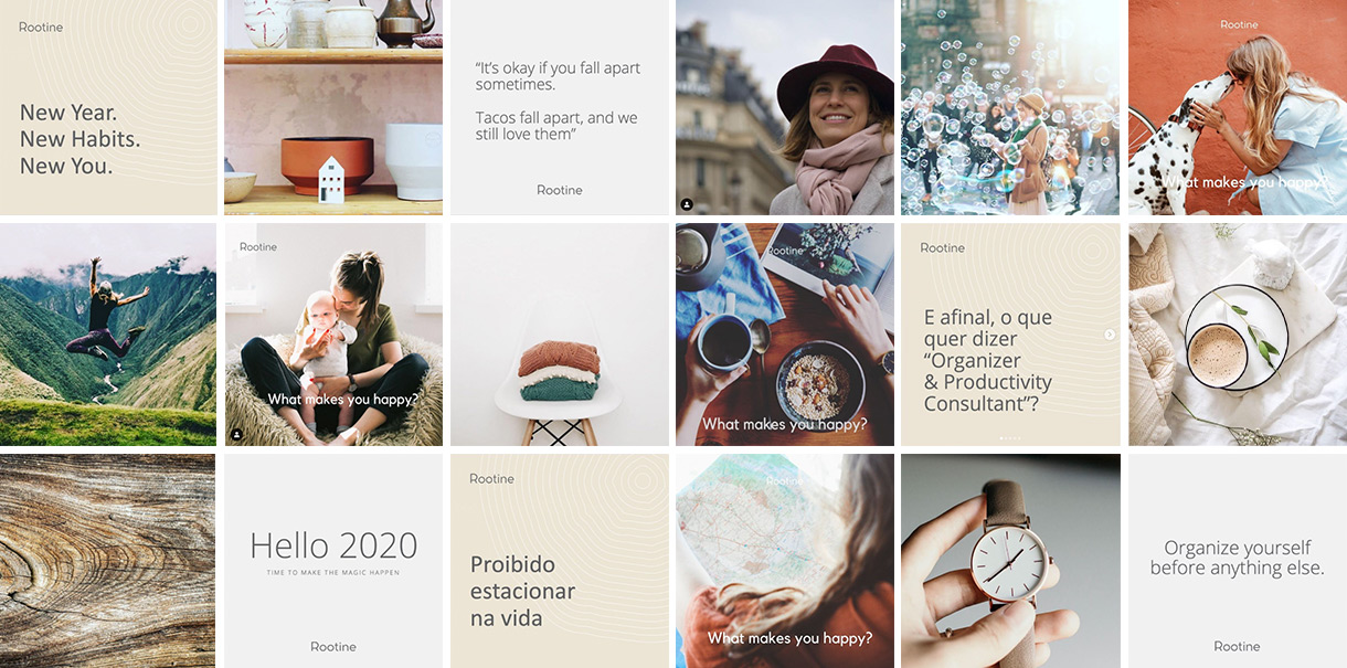
Warm tones and embossed paper are a complement the brand experience for a calming first impression. As it trespasses to digital platforms, curated images extend the brand’s values and look & feel, adding splashes of happiness, tranquility, and organization to a focused, professional yet friendly communication.
