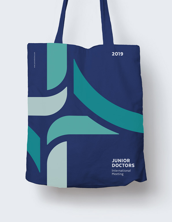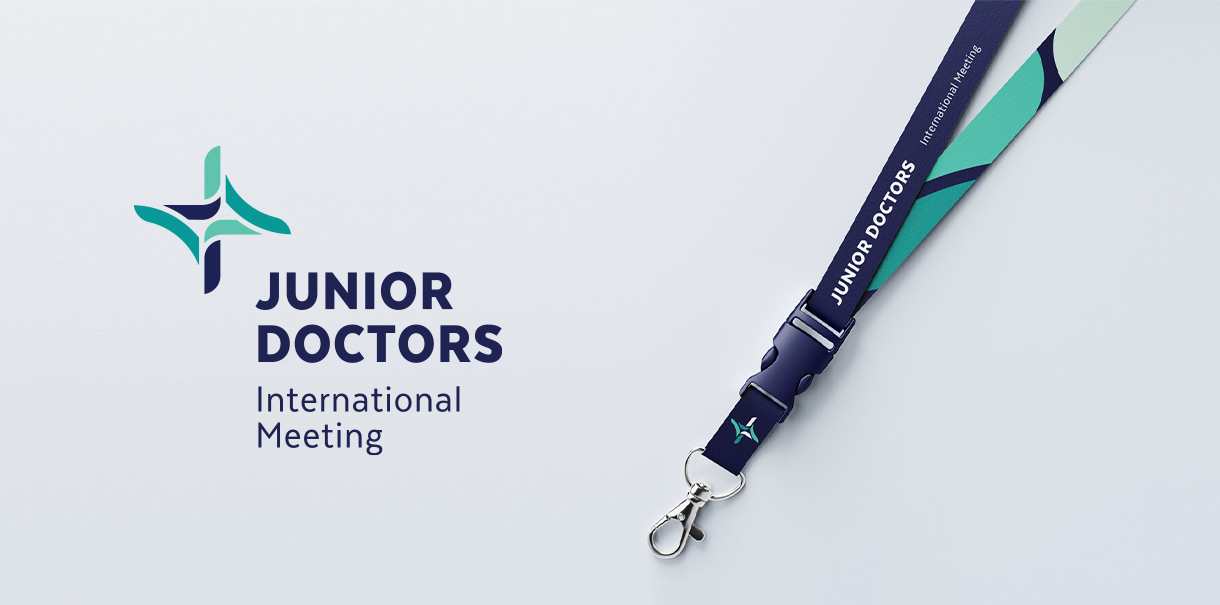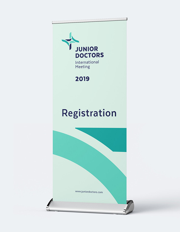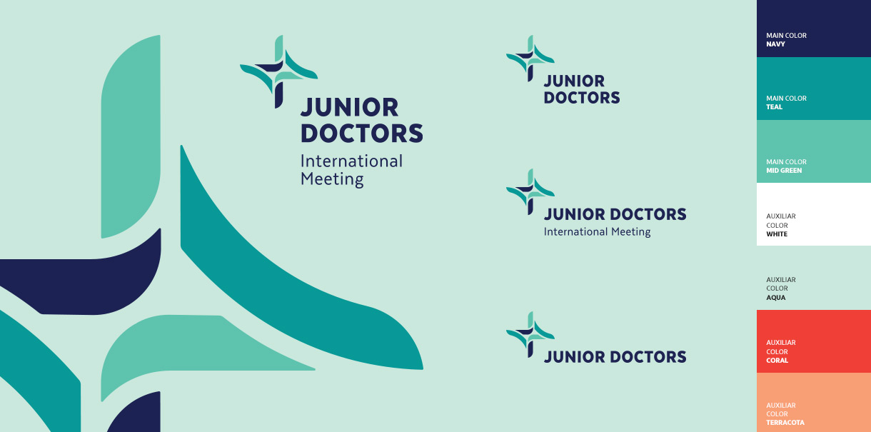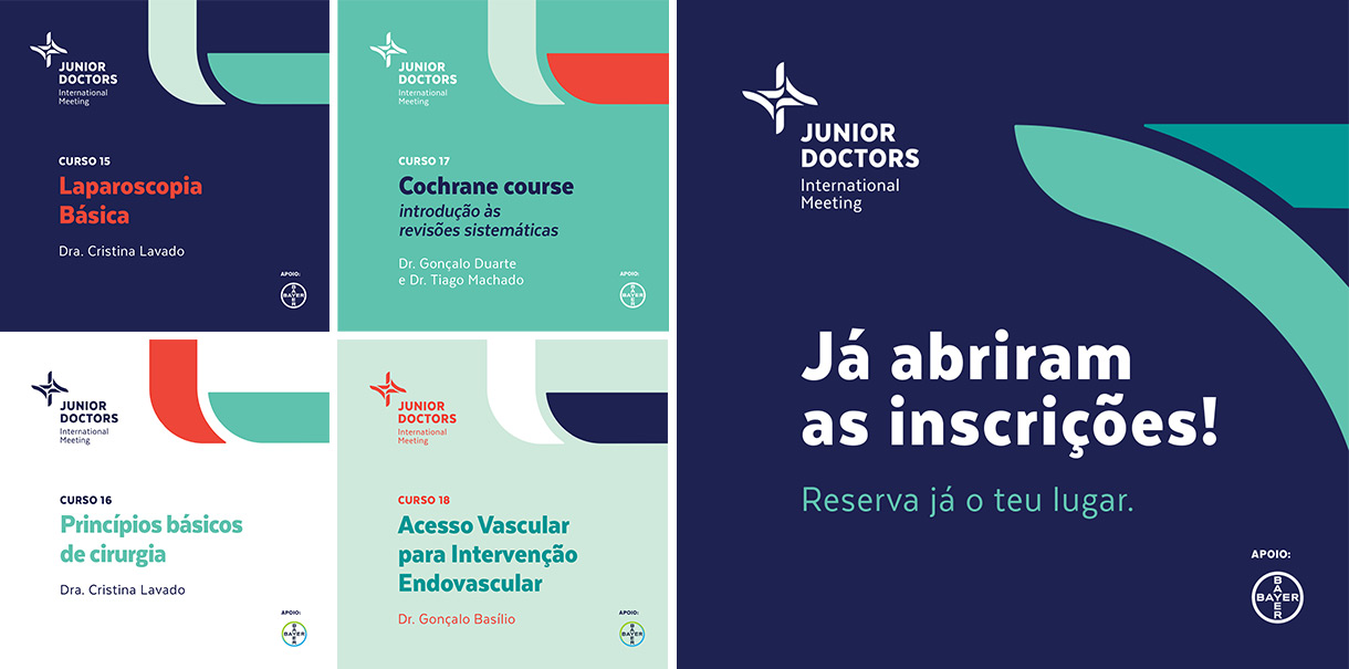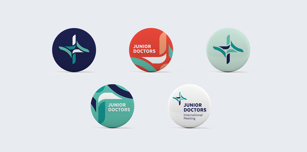
This event is organized by and directed to young medical doctors, so a dynamic and fresh identity was mandatory. Vibrant colors, clean elements, and contemporary typography helped to create a welcoming graphic universe. Based on a composed logo with a recognizable icon, this identity aimed to embrace numerous editions without compromising a versatile and professional image.
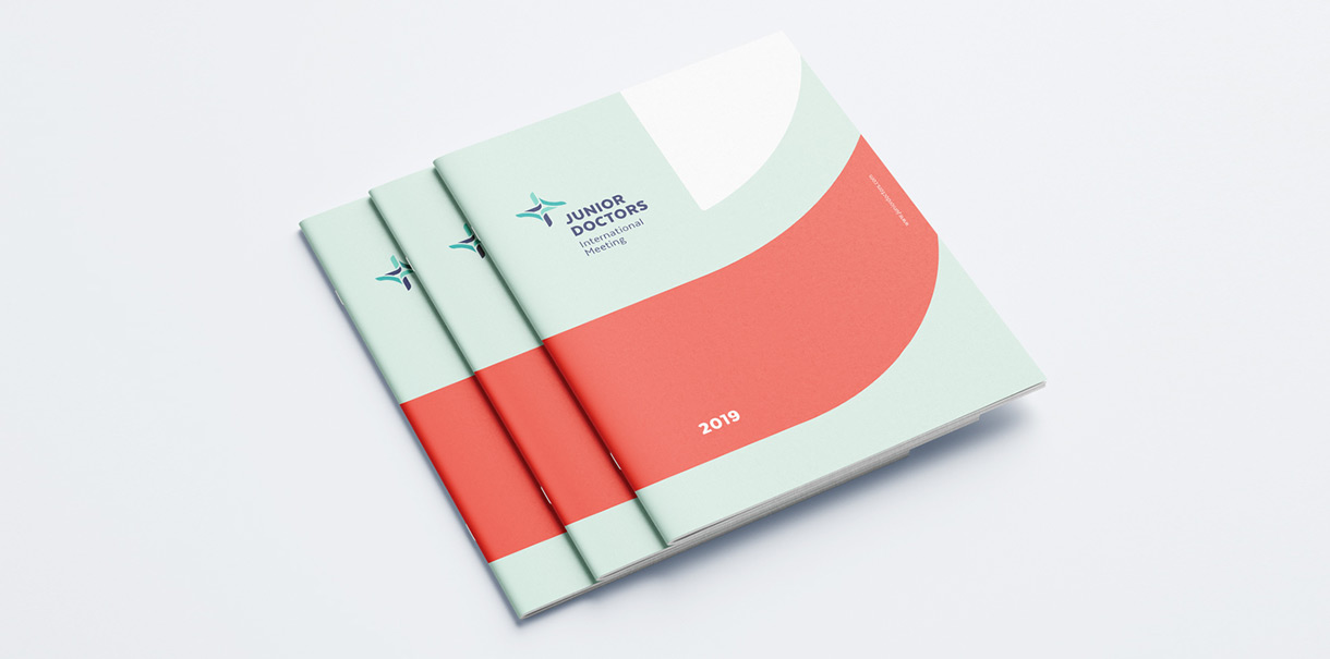
Logo, lanyard, event credentials, badges, stationery, totebag, booklet, roll-up, and Social Media templates and guidelines.
Relationships and sharing of Medical knowledge were the baselines for this identity’s development. The logo’s symbol represents a twisted stripe that insinuates the “cross” sign, which is quickly associated with health and medicine – this way expressing the connections and collaborations that allow for building a powerful Medical practice.
