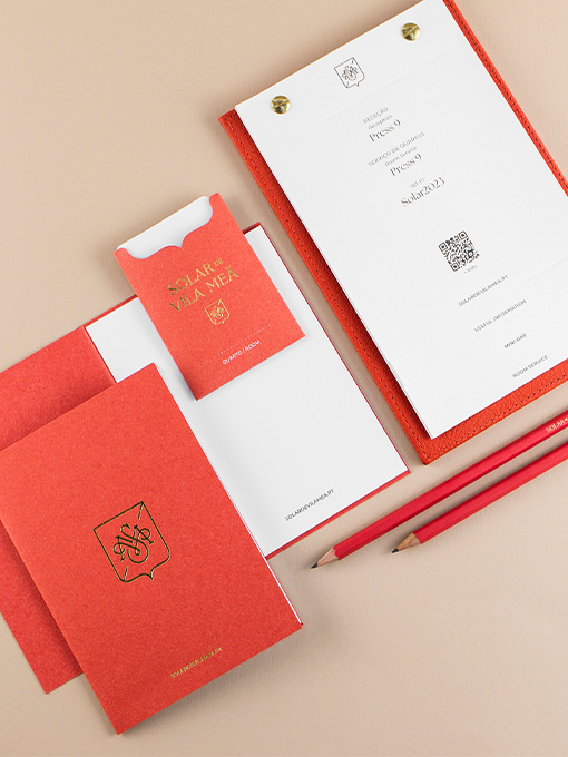
Business cards, envelopes, letterheads, booklets, keycard sleeves, water bottle labels, notebooks, amenities packaging, and signage were designed for the hotel. Combining gold foil, offset printing, and the powerful colour and texture of the paper, these materials...
SuperPlast
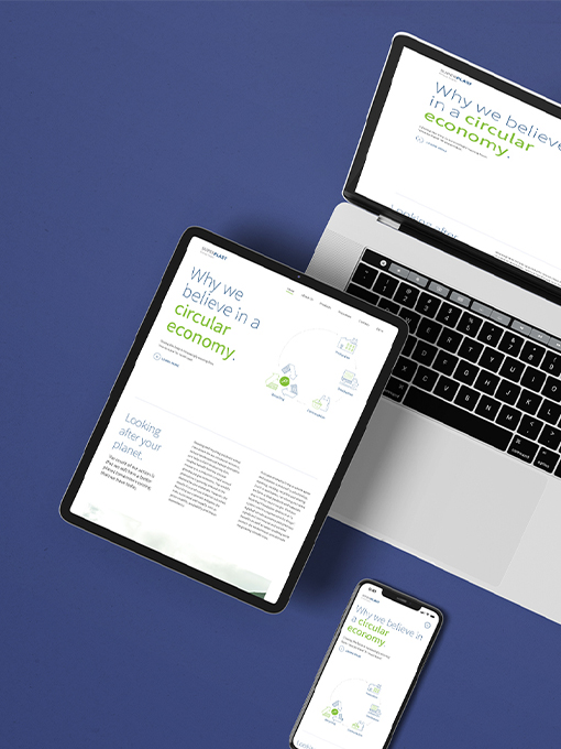
The SuperPlast website highlights the brand's concept and the recycling and circular economy processes clearly through explanatory infographics. With a strong presence at international fairs, various materials such as roll-ups, brochures, pens, and totebags are...
EABA
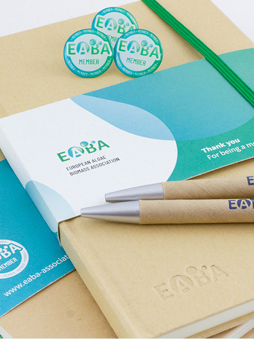
Scientific projects require clear communication of complex information. Impactful infographics facilitate understanding and enhance dissemination, attracting investment and delivering the right message to stakeholders. The brand identity captures the association’s...
General Annual Assembly
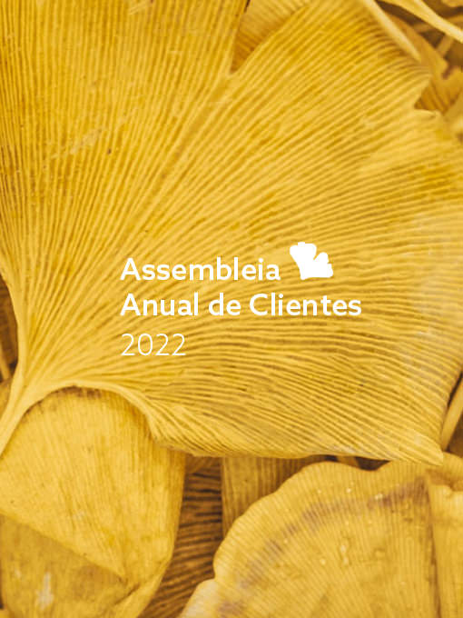
The General Assembly is an annual event dedicated to their clients, that lives with its own visual identity although always aligned with the main brand. This identity is adapted annually accordingly to the established theme in the Financial Report correspondent...
Aquanostra
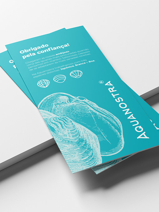
Aquanostra's logo already existed when we got to be part of this project, but it required some love and further structuring. We kept in mind the communication strategy in progress and our target audience when structuring all visual communication, developing a...
Larica Food Congress
Through a dynamic identity, which symbolically represents the various food groups, we have built a system that lives on the broad range of applications of the brand, which results in a set of colors, patterns, and typographic compositions with a young and energetic...
