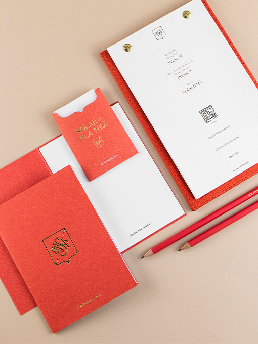
Business cards, envelopes, letterheads, booklets, keycard sleeves, water bottle labels, notebooks, amenities packaging, and signage were designed for the hotel. Combining gold foil, offset printing, and the powerful colour and texture of the paper, these materials...
Gardenuity
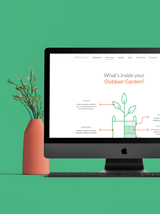
Divided in two different websites, customer oriented and B2B, the brand's digital presence embraces a welcoming, nature-inspired aesthetic through simple, clean design elements. Although very different in structure, the two websites present a cohesive look & feel,...
SuperPlast
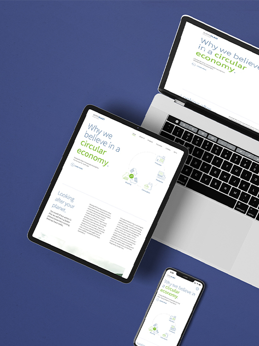
The SuperPlast website highlights the brand's concept and the recycling and circular economy processes clearly through explanatory infographics. With a strong presence at international fairs, various materials such as roll-ups, brochures, pens, and totebags are...
Planta-la
Specializing in plants with exposed roots, it creates unique experiences that connect people to the rich history of plants. The concept, “Every Way Growth,” highlights the organic beauty and resilience of plants as they flourish in water-based environments.Inspired by...
EABA
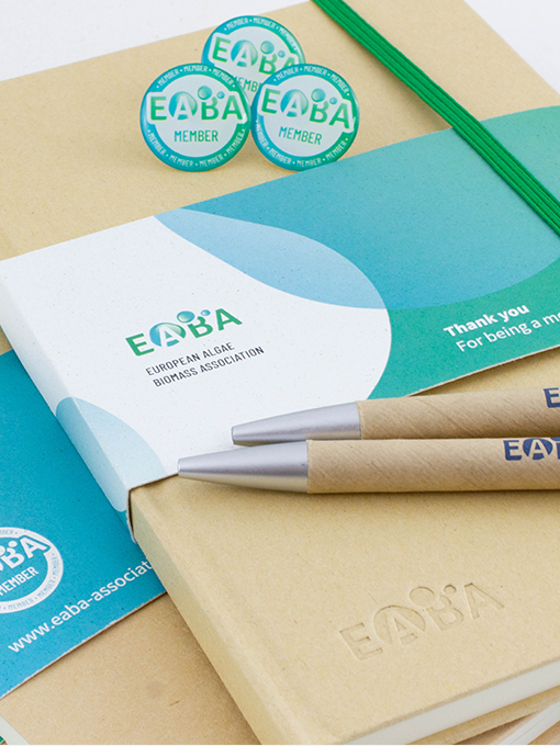
Scientific projects require clear communication of complex information. Impactful infographics facilitate understanding and enhance dissemination, attracting investment and delivering the right message to stakeholders. The brand identity captures the association’s...
Cell4food
Warm tones and infographic elements create an inviting look, essential for building brand trust and connecting with the target audience. With primary touchpoints at international fairs, presentations, and the website, we developed cohesive materials to ensure a...
B.ALL
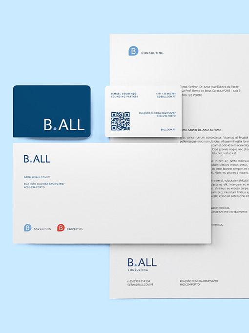
The identity is anchored on the potential of mediation to enable all opportunities to "be all you can be". Trust, integrity, and accuracy are core ideas made visual through a solid typographic brandmark. Balanced and distinct, this logo conveys the brand's values and...
Rootine
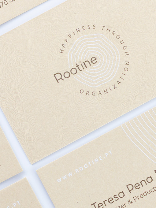
Roots are strength and sustenance, the basis of what grows and rises, be it a tree, a house (foundations), or life itself (values). Going for a visual metaphor of life as a growing and everchanging element, we dwelled on the concentric rings that emerge from a...
Save & Grow Platform
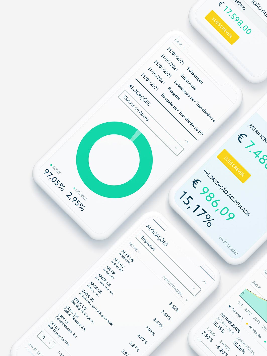
Based on the language developed on the website's presentation page, we designed the entire user area, from subscription to assets management, for a great experience and consistent visual language. We defined clean layouts and tables thought to detail, priming...
Magrid
This brand will live on digital supports, mainly through the Magrid App. We have worked on a logo that reflects a sense of union and versatility through the typographic representation of connections. Vibrant colors and a playful look and feel contribute to...
Sem Espinhas
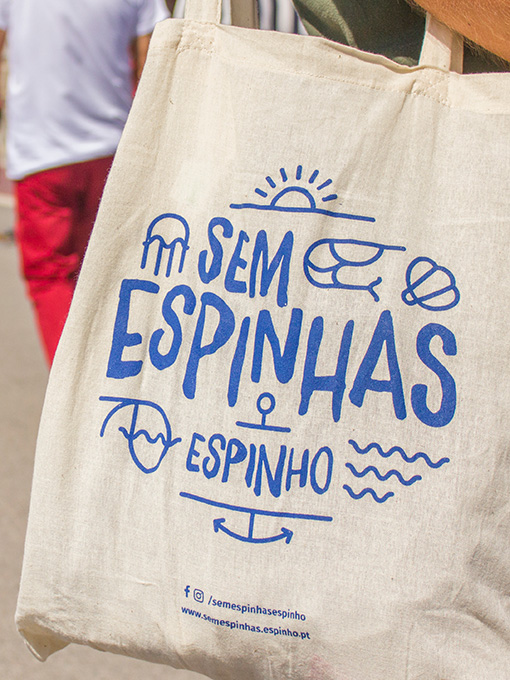
Considering the need for unified but differentiated communication, we have proposed a photographic approach as a baseline for all visual materials. The focus was to depict Espinho's fish and seafood as the raw matter that brings everything together. Specific...
